
App Components
The app itself it comprised of a few screens mainly pulling some data off of a couple of Google sheets. The screens I created are;
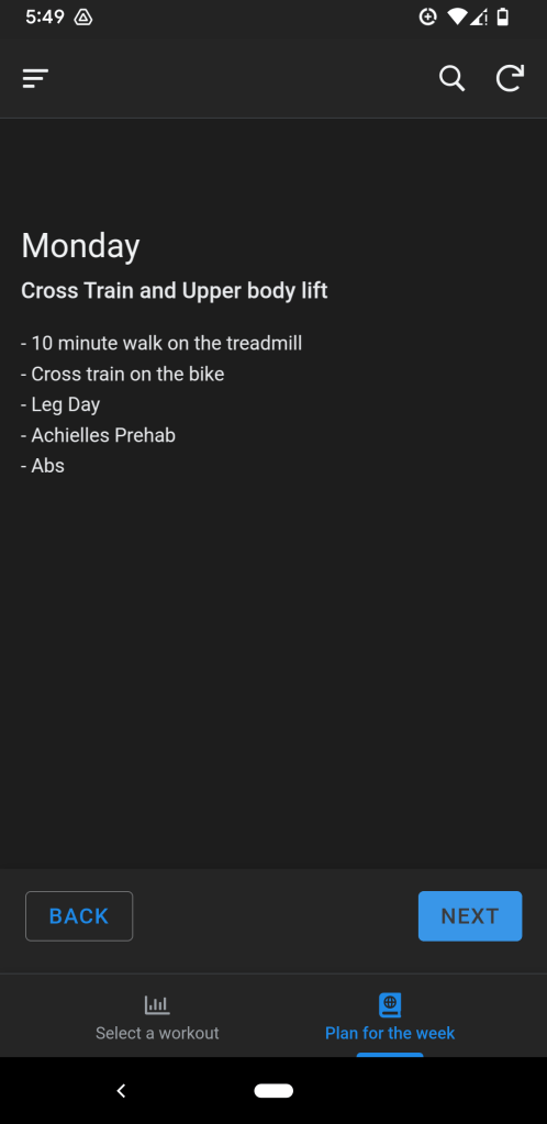
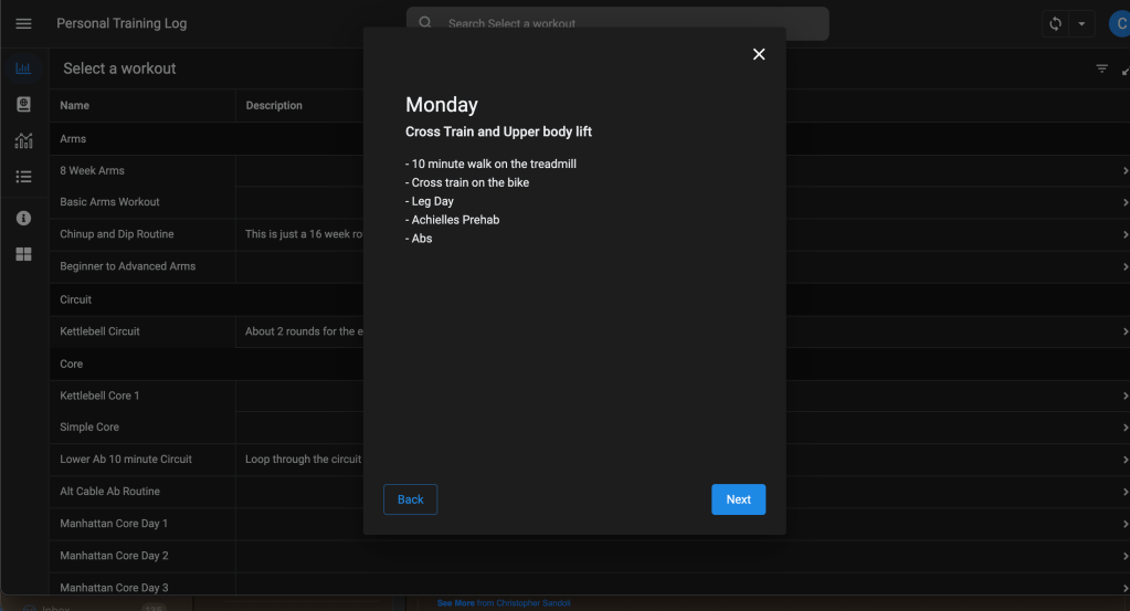
- Plan for the week – This functions similar to a carousel, that reads off of another table to see what the details are for each day of the week. It’s useful to give an overview for an athlete maybe logging in to see what the summary of the week is going to be like.
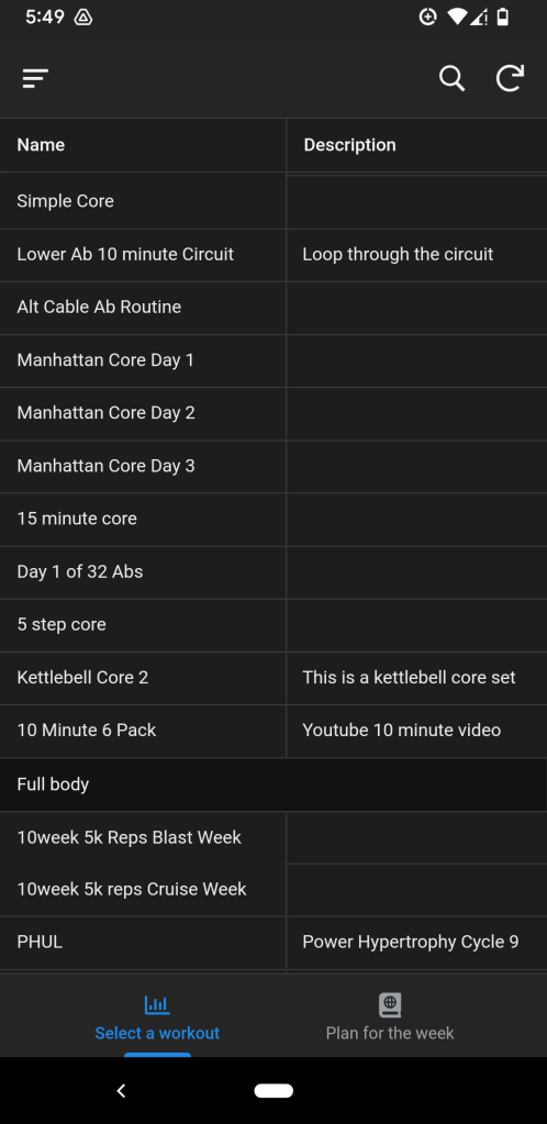
- Browsing for workouts – This is the main view for scrolling/searching through a the saved workout inventory list that I created.
- Workout Details – This is the detail screen after selecting a workout from the previous screen above.
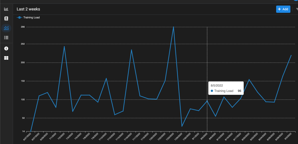
- Last 2 weeks of load – This was originally used to give myself a quick glance at my last two weeks of training. After entering some data from each workout (minutes in each heart rate zone), the data would display on a graph to show, if I am training at an optimal level.
- Training Table – This is the simple table view of data that is used to create the view above, and other things.
Screens
Below you can check out a few snippets of the UI screens that I mentioned above.
(click on each image to see more details about each screen)
Where are things today?
So not long after creating this entire app for myself did I upgrade my smartwatch to the Garmin Forerunner 255 Music. Well, it pretty much killed everything that I worked on… Garmin has their own platform to create workouts, track your activity load, body battery, and so much more without the need to input everything at the end of the day.
Most of the app I retired since I wouldn’t be crazy to keep track of things in two places, and Garmin has a calendar feature as well. Plus a multi-million dollar corporation had a much better product than myself. I still use this regularly to keep an inventory of workouts that create, and it’s useful to keep an inventory to quickly search and pull up when you need some ideas week to week.

Leave a comment